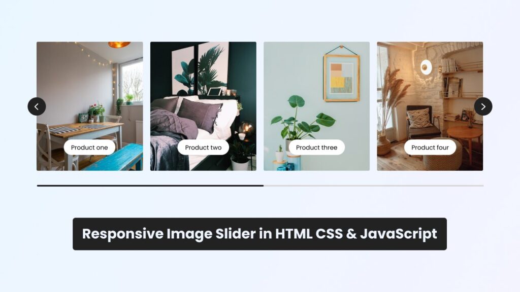
Cascading Style Sheets (CSS) is a powerful tool for building a responsive image carousel that adapts seamlessly to different screen sizes and devices. By using CSS media queries, designers can create dynamic layouts that ensure optimal viewing experiences on desktops, tablets, and smartphones. CSS properties such as flexbox and grid enable precise control over the positioning and sizing of carousel elements, while transitions and animations add fluidity and interactivity to the image slideshow. With CSS, designers can craft visually engaging and user-friendly image carousels that enhance the overall design and functionality of websites.
What is a Responsive Image Carousel?
A responsive image carousel is a popular element in web design that allows multiple images to be displayed horizontally in a sliding motion. It adapts to different screen sizes and ensures a visually appealing experience for users across various devices.
How to Build a Responsive Image Carousel with CSS
To create a responsive image carousel, follow these step-by-step instructions:
Step 1: HTML Markup
Start by setting up the HTML structure for the image carousel. Use the following code as a starting point:
“`


“`
Make sure to replace “image1.jpg”, “image2.jpg”, and “image3.jpg” with the actual image file names and adjust the “alt” attribute accordingly.
Step 2: CSS Styling
Next, style the carousel using CSS. Add the following code to your CSS file or within the `